

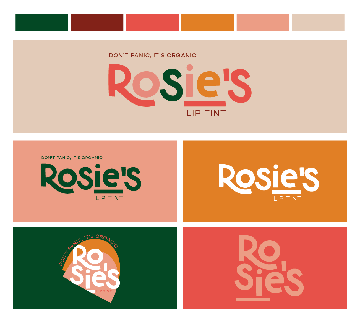

ROSIE’S LIP TINT / ORGANIC SKINCARE
The Vibe: Bold + Colorful + Fun
Deliverables: Full Brand Identity / Primary Logo, Secondary Logo, Logo Marks, Brand Pattern, Typography Pairing
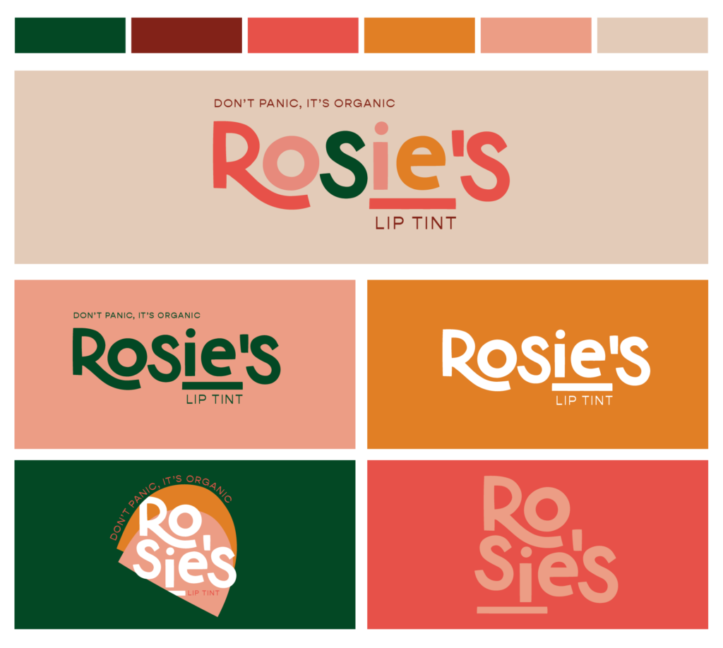
When we started this branding project we knew that we wanted this logo concept to feel creative, fun and bold. The goal was to find a font that is clean while also being playful and impactful (which is how skincare should feel)! Intentional placing of the tagline will make it simple to change out if and when the product line expands down the line.
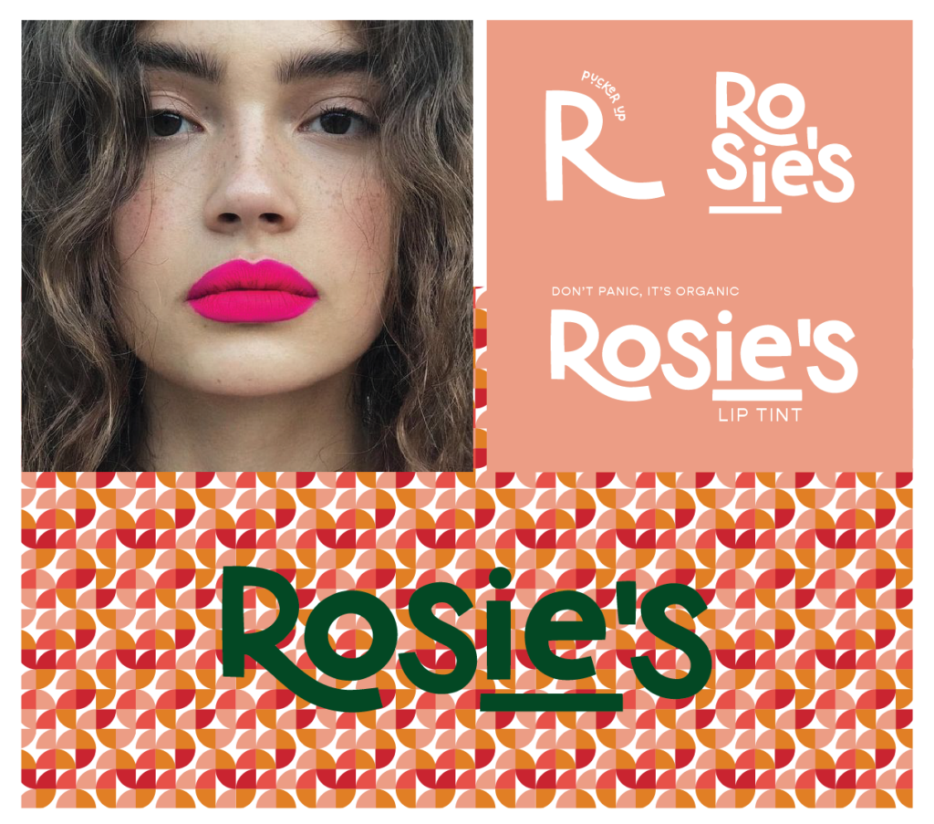
One of our favorite parts of the design process is creating a custom pattern. For Rosie’s we created a pattern using their primary color tones to make a big statement on the look and feel of the overall brand. Custom pattern elements can be used in package design, business cards, and all throughout marketing collateral.
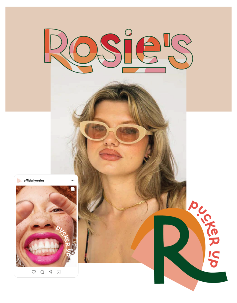
photo credit
photo credit
We love how Rosie’s Lip Tint brand identity can grow with the brand. Overall it’s bold, approachable and versatile.
If you’re ready to jump into our branding, photography or website design process, be sure to reach out HERE! We already can’t wait to work together and to bring your brand to LIFE!


you said: