


We’ve said it before, but it’s worth saying louder: great branding starts with clarity. And when it comes to Lineberry Photography Co. and The Foundry Creative Co., Brittany came in crystal clear.
This project wasn’t just a refresh. It was a reintroduction. A chance to give each brand its own spotlight while still staying rooted in the same story: relationships first, creativity always.
We’re so proud to finally share the full brand reveal and custom brand shoot for this powerhouse duo.
Meet the Brands
Let’s start with what they have in common. Both brands are built on connection. Both are grounded in authenticity. And both exist to help people feel seen and celebrated in the work they do.
But they lead in different ways:
The Foundry Creative Co. is the bold one. Bright colors, big ideas, and a vibe that feels like iced coffee, loud playlists, and confetti in your tote bag. This brand is the business bestie! Ready to challenge, celebrate, and cheer on her fellow creatives.
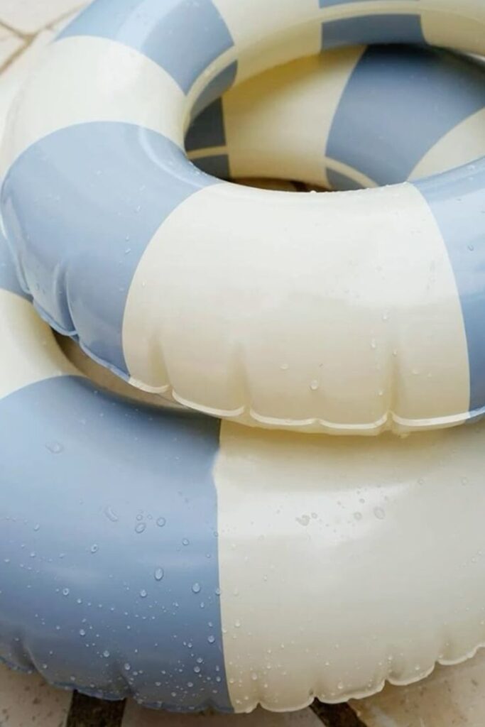
Lineberry Photography Co. is the calm creative. Steady, soulful, and full of heart. Her visuals are golden hour in brand form. She captures people in their best light and tells stories that linger.

Each brand needed its own look, feel, and tone without losing the shared heartbeat behind both.
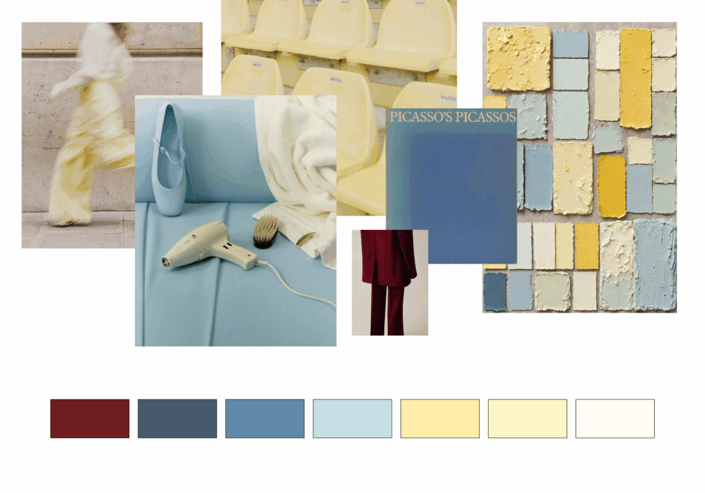
The Design Direction
We built two distinct but connected visual systems:
- The Foundry leans citrus, sky blue, and buttery yellow. Playful typography, expressive layouts, and just the right amount of personality.
- Lineberry brings softness with sunwashed greens, whites, and muted summer tones. Her logo is clean, confident, and calm.
Together, they reflect Brittany’s range and vision. She’s not just a photographer. She’s a strategist, a brand advocate, and a creative partner. These visuals catch up to that.
How We Built It
Before we picked up a camera, we locked in the brand direction. Typography, tone, color palette, messaging. Everything was dialed in first so we could show up to the shoot with total clarity.


This wasn’t about making them match. It was about helping them speak to the same audience in different ways both with confidence and consistency.
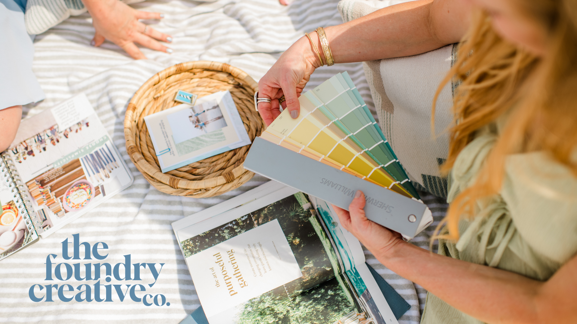
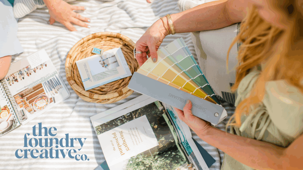
The Shoot: Sunshine, Strategy, and Style
To bring it all to life, we created a photo shoot that celebrated the full spectrum of Brittany’s work.
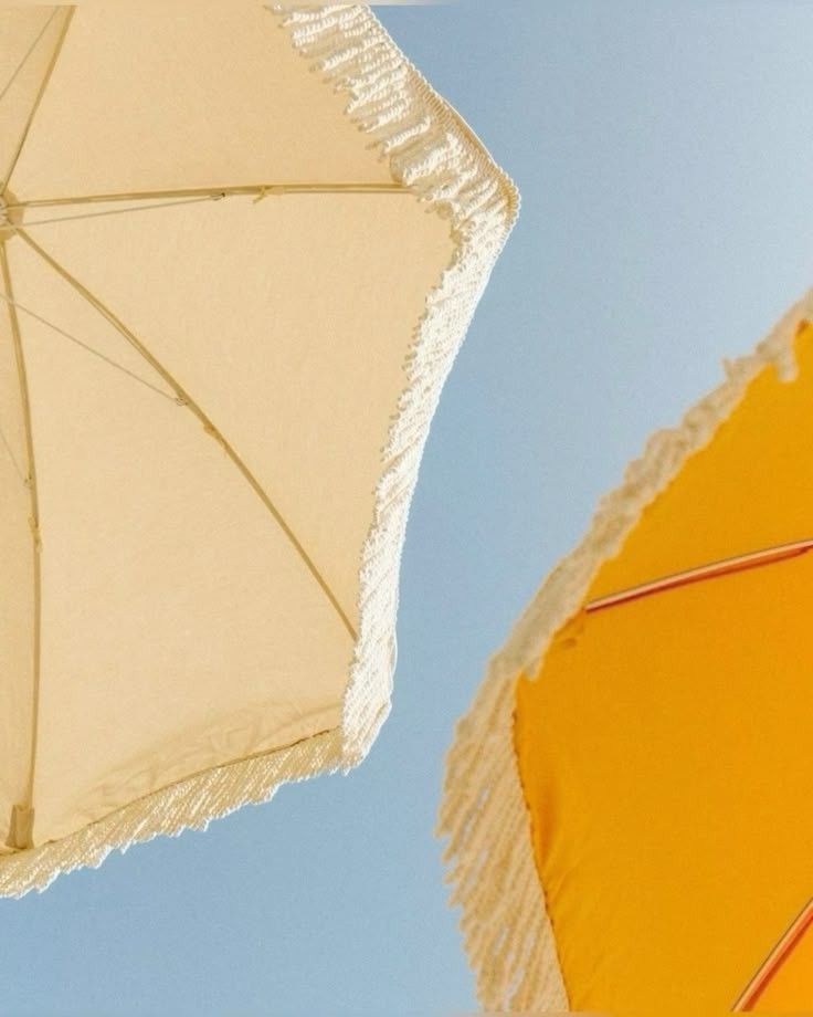
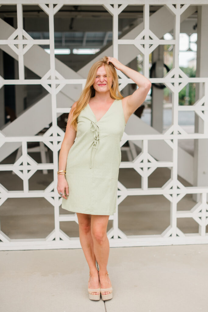
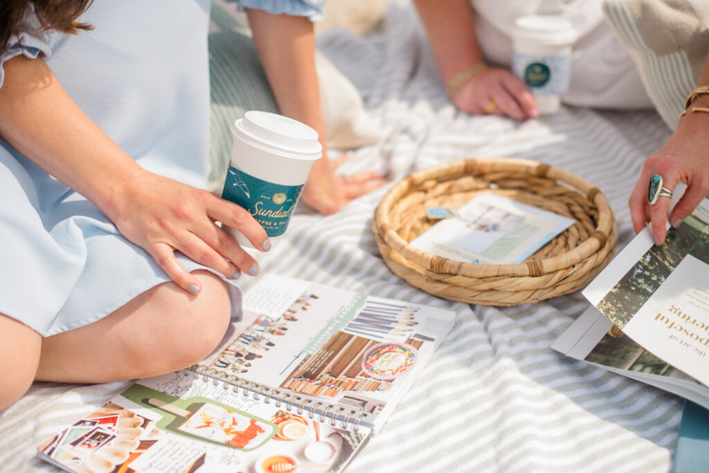
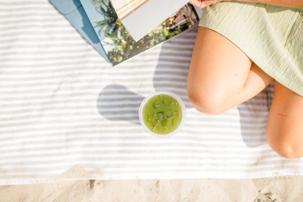
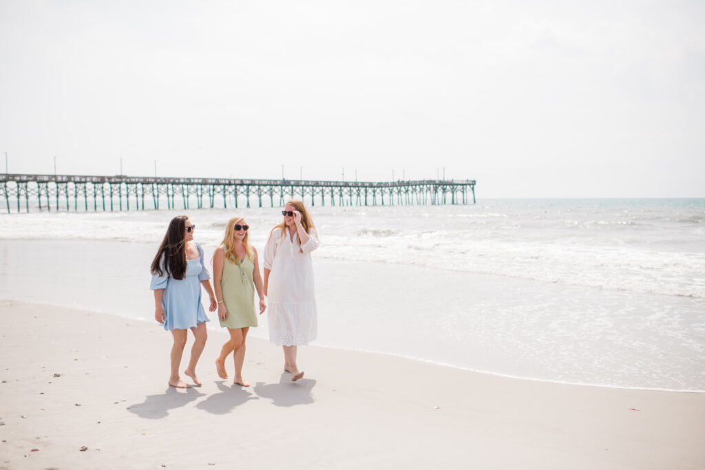
For Lineberry Photography Co., we leaned into natural textures and softer light—close-ups with movement, quiet joy, and golden tones. Think ocean breeze, hands in the sand, shadows dancing across her face. Personality-forward without ever feeling posed.
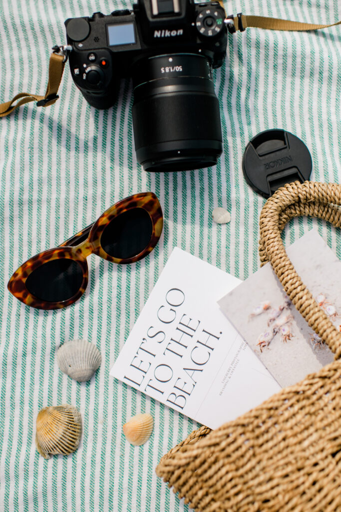
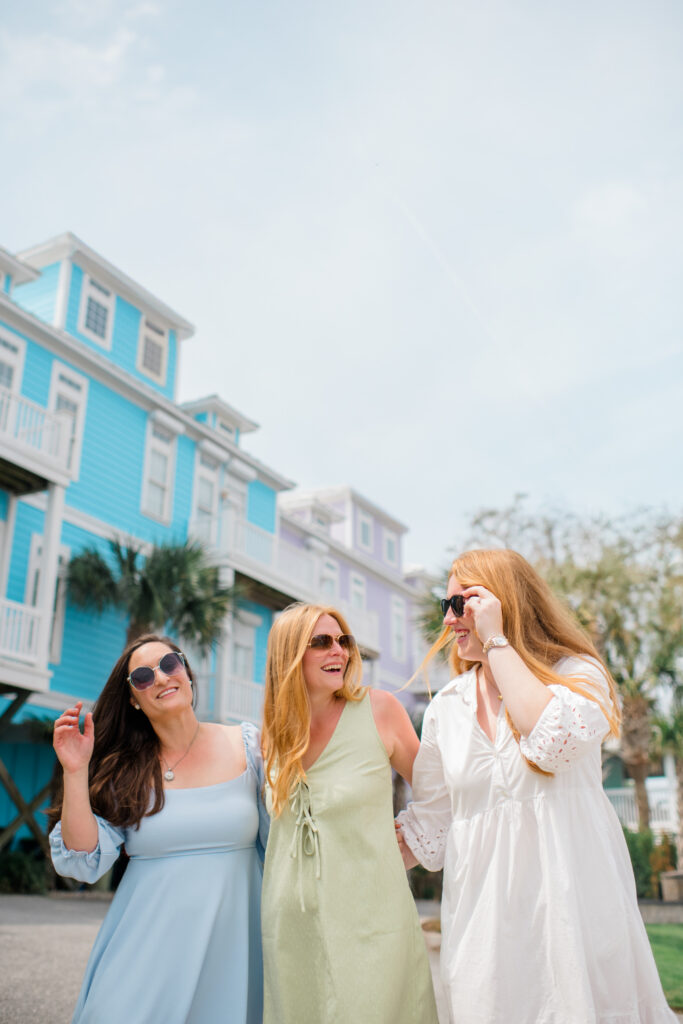
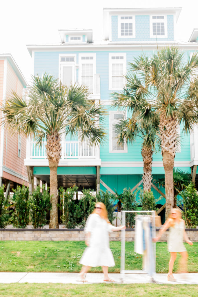
For The Foundry, we went downtown Surf City and made it pop. White lattice walls, palm trees, creative team moments, and even a taco window cameo. There were confetti bursts, notebook scribbles, team huddles, and walk-and-talk strategy shots. The energy was magnetic.
Every scene was carefully styled, from the sunglasses and coffee cups to the beach bags and color swatches. It was curated, but never stiff. Polished, but never boring.
This wasn’t just about making something pretty. It was about showing Brittany and the brands exactly as they are.
The Brands
Phase 1 gave us the foundation: core branding, lifestyle headshots, and a full creative direction to move forward with confidence. Next up is Phase 2: illustrations, submarks, branded templates, and all the extras that will support these brands as they scale.


Want to see what branding that actually feels like you looks like?
We’d love to help you create your own brand system that’s full of energy, clarity, and style that lasts.


you said: