


Let’s be real—standing out in today’s business world can feel like a full-time job. With so much noise online and in real life, how do you make sure your brand gets noticed? While colors, logos, and imagery all play a huge role, one often-overlooked element that can make a massive difference is typography—specifically, bold typography.
Using bold, expressive fonts isn’t just about making your text bigger or darker. It’s about capturing attention, showcasing your brand’s personality, and driving home key messages. Whether you’re launching a new product, running a promo, or sharing your story, the fonts you use say a lot about who you are as a brand. And trust us, bold typography can be your best friend when it comes to grabbing attention.
We know small business owners (because we are one!), so we’re here to give you some practical tips—plus a few examples of brands that get it right—to help you use bold typography in a way that speaks directly to your customers, and makes them listen.
Why Bold Typography is a Game-Changer
- It Grabs Attention—Fast First impressions matter, especially online. Bold fonts stop people mid-scroll. They demand to be noticed. Whether it’s on your website, social media, or printed materials, bold typography draws the eye and tells people: This is important, pay attention!
- It Communicates Your Brand’s Personality Fonts have personalities, just like people! Are you fun and playful? Bold and edgy? Professional and trustworthy? The fonts you use will communicate those traits instantly. Choosing the right bold typography helps reinforce who you are and what you stand for, even before anyone reads a word of your content.
- It Makes Key Messages Pop Bold typography isn’t just about looking good—it’s functional too. It helps you organize information and highlight what matters most. Think of it as a spotlight, shining on your headline, call to action, or the key benefit of your product. It’s an easy way to guide people through your messaging.
Ready to Go Bold? Here Are Some Easy Actionable Tips:
1. Define Your Brand’s Personality First
Before you start experimenting with fonts, take a moment to really define your brand’s personality. Are you bold and sassy? Elegant and sophisticated? Playful and fun? Once you know this, you can choose typography that reflects your vibe. For instance, a chunky, fun font might be perfect for a children’s boutique, while a sleek and modern bold serif might work better for a luxury spa.
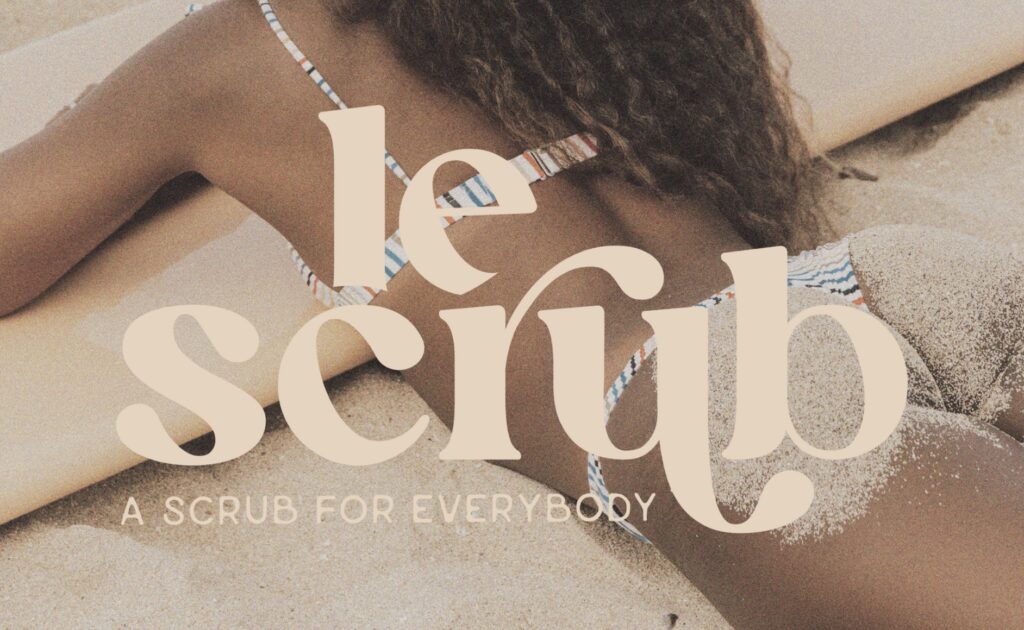
Example: Look at Le Scrub, our semi custom brand that uses bright, playful fonts to express its fun, quirky brand. Their bold typography makes a lasting impression and the bubbly letters scream fun!
Action Tip: Create a quick brand personality board (yes, it’s fun!). Include colors, images, and fonts that reflect your brand. When you find fonts that align with this, you’ll know you’re on the right track.
2. Use Bold Fonts for Headlines and CTAs
Let bold typography do what it does best: make your key messages stand out. Use it for your website headers, product names, taglines, and calls to action. But don’t go overboard. If everything is bold, nothing will stand out. The key is balance—let your bold fonts do the heavy lifting for the most important parts.
Action Tip: Go to your website or latest social media post and look for one or two key phrases that you really want people to notice. Update them with bold typography and see how it instantly draws more attention!
3. Mix Bold Fonts with Simpler Ones for Contrast
One of the secrets to making bold typography shine is pairing it with something softer or more subtle. Think of it as creating a visual balance. A bold font combined with a lighter or simpler one not only looks great but makes your message easy to digest. It’s all about creating contrast so the important stuff gets noticed.
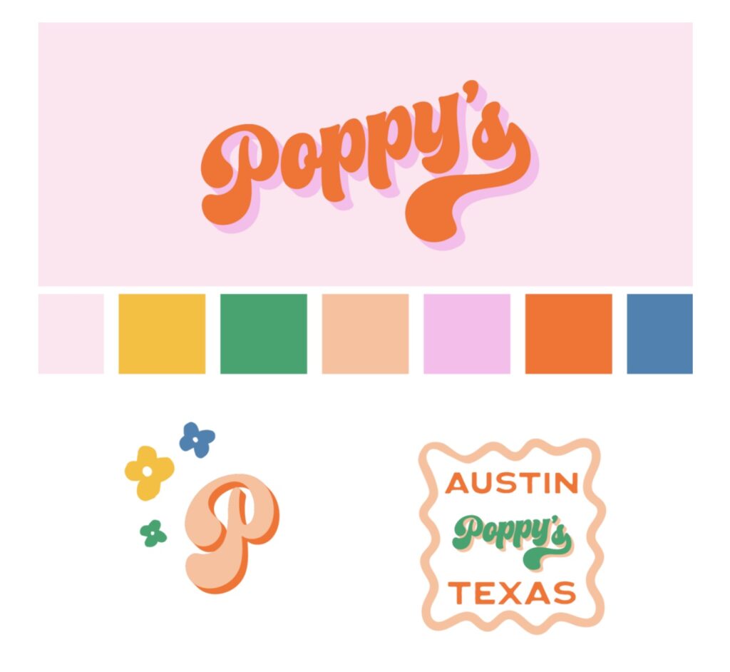
Example: Poppy’s, the semi custom brand, uses bold, modern fonts for their main brand but contrasts them with delicate, smaller fonts for product descriptions. This creates a high-end, sophisticated look that reflects their minimalistic yet premium brand values.
Action Tip: Try pairing a bold sans-serif font for your headers with a clean serif font for body text. Tools like Google Fonts are a great place to play around with combinations.
4. Stay Consistent Across All Platforms
Whether you’re posting on Instagram, handing out business cards, or designing your packaging, consistency is key. Your typography should feel cohesive across all touchpoints. This creates a memorable, professional brand that people can recognize instantly—whether they’re scrolling through their feed or passing by your store window.
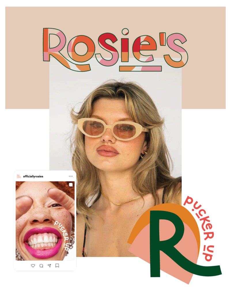
Example: Rosies does an excellent job of keeping their typography consistent across all platforms. Their bold, simple typeface is instantly recognizable. That consistency reinforces their modern, minimalist brand and keeps their identity fresh in people’s minds.
Action Tip: Pick two to three fonts (including your bold font) and stick with them across everything. Create a mini style guide for yourself or your team to follow, and make sure all your brand materials match.
5. Test It on Mobile
We all live on our phones these days, so it’s essential that your bold fonts look just as good on a tiny screen as they do on a big one. What looks great on your laptop might feel cramped on a phone screen. Make sure your bold typography is readable and impactful across all devices.
Action Tip: Pull up your website or recent email on your phone. Are the bold fonts clear and easy to read? If not, try adjusting the size or spacing to make sure it’s mobile-friendly.
Bold Typography Is Your Secret Weapon
Bold typography isn’t just about making text bigger—it’s about capturing attention, expressing who you are, and guiding your audience to take action. For small business owners, this is a simple yet powerful way to create a memorable brand that resonates with customers.
At Drewe and Kate Branding Co., we specialize in helping small businesses like yours tell your story through design. Need help choosing the perfect bold typography for your brand? We’re here for you. Let’s make your brand stand out!


you said: