


Project Scope: Brand Identity Development + Brand Photography
ABOUT THE BRAND:
Born out of a passion to connect with and help others, The Caitlin Richardson Group is a real estate group dedicated to helping elevate client experiences when buying or selling their home. This is visually represented through their branded elements and color story. Blue hues represent stability, calmness, and productivity and are all things clients will find when working with their team.

BRAND ELEMENTS FOR THE CAITLIN RICHARDSON GROUP
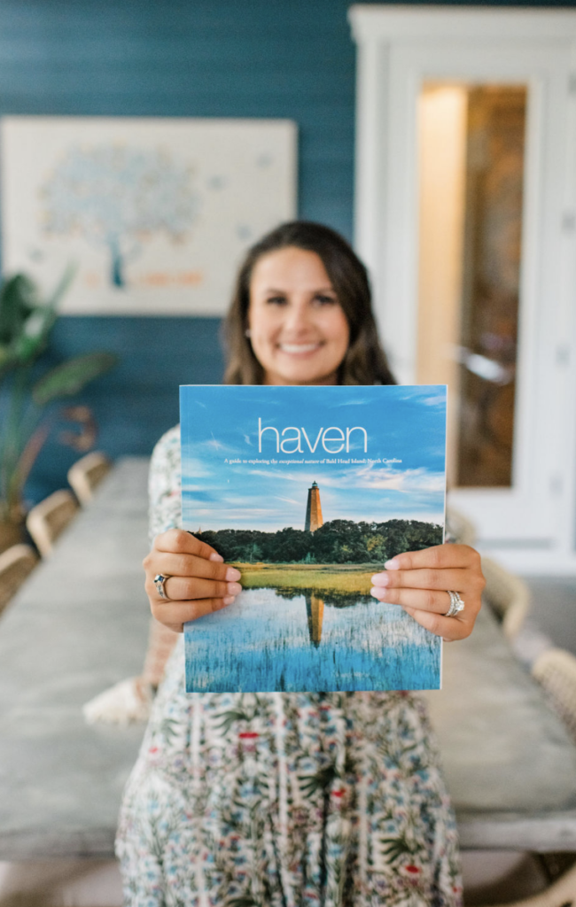
Your brand elements are the unique aspects of your brand that create a cohesive, recognizable image for your business and extend into everything you create. Branded elements also help you stand out from your competitors and are used to enhance your brand identity. For Caitlin’s brand we wanted to incorporate the Old Baldy Lighthouse, a regional symbol of character and charm! These elements are useful and help the public identify your brand and should be used as a supplement to your branding.

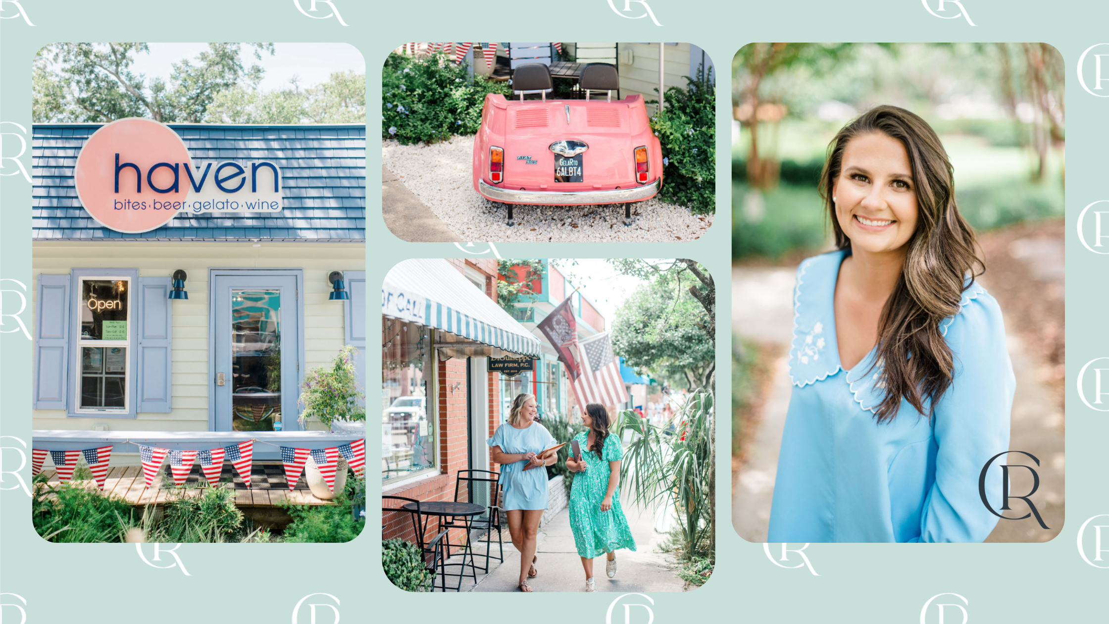
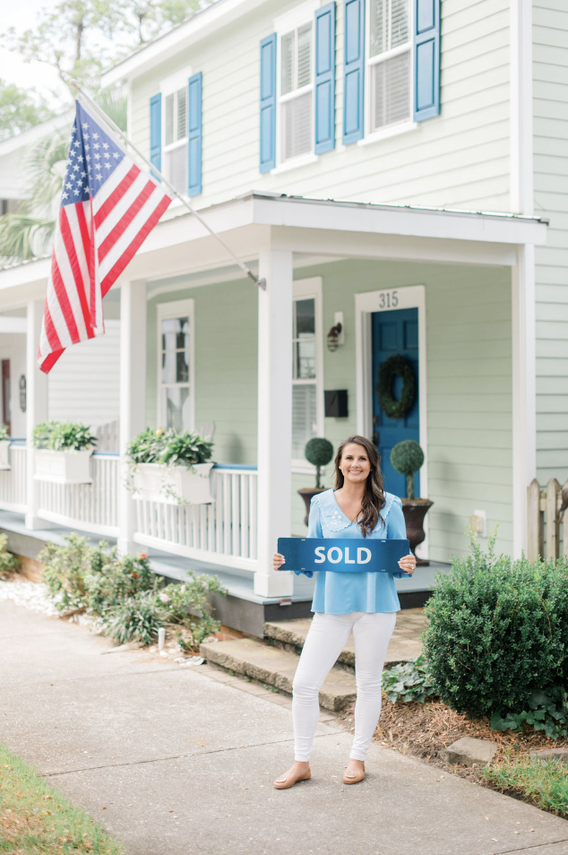
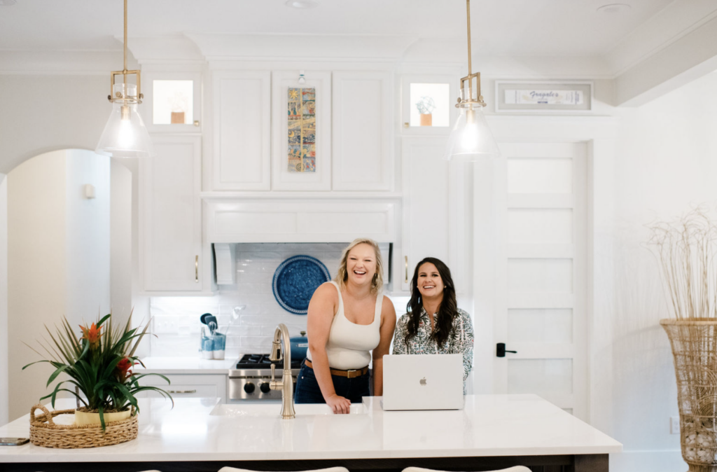
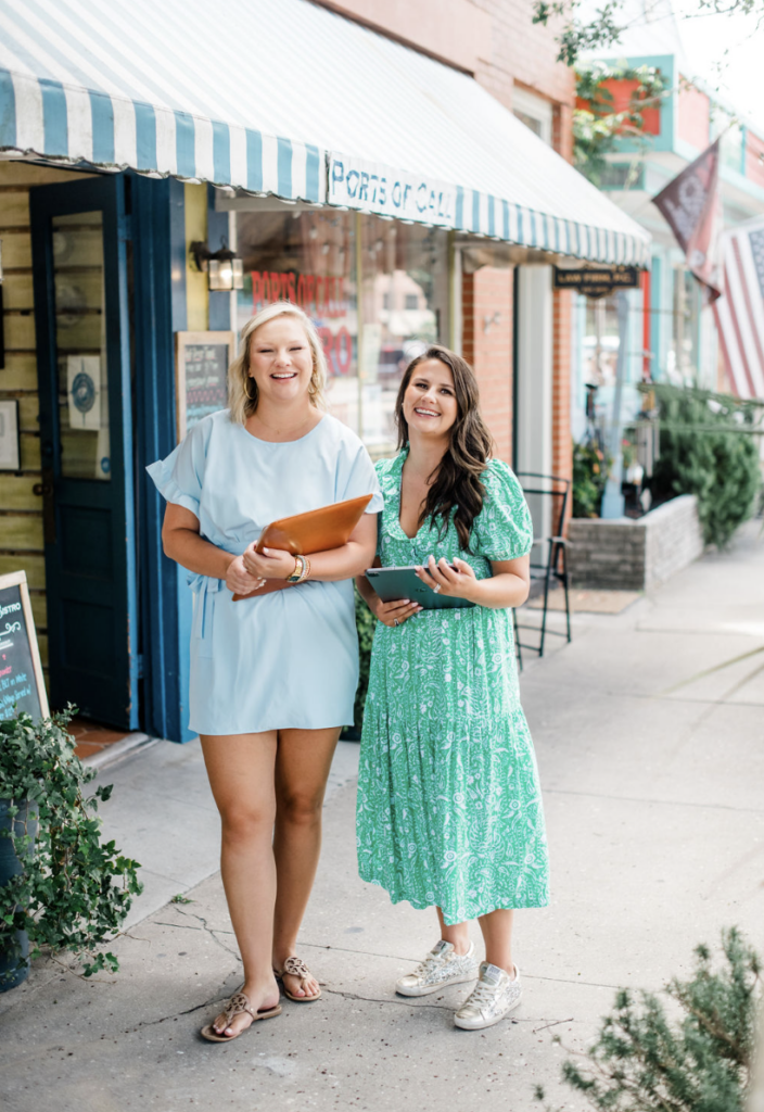
BRAND PHOTOGRAPHY FOR THE CAITLIN RICHARDSON GROUP
Caitlin’s brand colors are shades of blue, so we wanted her brand photography to reflect that. We call Caitlin the unofficial mayor of South Port, North Carolina, because she knows everyone there! We wanted to capture Caitlin’s friendly, neighborly personality, so we took a tour of Southport and photographed her at all of her favorite spots.


you said: